Designing for Nexent Bank
How do you turn a well-known financial product into a digital-first brand? This is the story of how the Metyis Design Studio helped Nexent Bank reinvent Card Avantaj through a new app experience, a distinct brand identity, and a research-led design approach.
Nexent Bank, formerly Credit Europe Bank, is a Dutch-licensed bank founded in 1994. In Romania it is best known for Card Avantaj, one of the most widely recognised credit cards in the market and the anchor of a 20-year presence there. The bank wants to reclaim its position as the country's leading independent consumer finance institution, and to get there it is moving from a branch-driven model to a digital- and customer-first one. A completely rebuilt Avantaj app is central to that shift.
The starting point set the challenge. The legacy digital onboarding was long, running to 25 steps and 19 documents, and its conversion rate fell well short of what the bank's growth targets needed. The Metyis Design Studio joined to help replace it. Our work spanned two connected streams: UX/UI consulting for the app and web, and hands-on communication and brand design. The brief came with a demanding deadline: a first working version of the app in three months.
This article looks at how those two streams worked in parallel, under time pressure and inside an existing corporate brand system, to give a widely used product an identity of its own. (For the wider partnership story, see our earlier piece, Transforming Nexent Bank.)
How it started
On the product side, Metyis worked mainly as a UX/UI consultant: shaping the direction, questioning decisions, and occasionally doing hands-on design work. Zitec owned design and development. The timeline was tight. Metyis assessed the existing design system in late 2024, then moved into consulting and a discovery workshop; brand and development work ran through spring 2025; the app went live in July 2025. With a first MVP due in three months, there was little room for long discovery cycles.
The first question was a practical one: how complete was the existing design system, and how easily could it be rebranded? The answers set how much could be reused and how much had to be rebuilt.
The Zitec / Metyis partnership
Three organisations were involved: Metyis (UX/UI consulting, plus hands-on brand and communication design), Nexent Bank (the client), and Zitec (design and development). At the start, with everyone moving quickly, several things were still unclear: governance, budget, and the scope of the MVP. There was also a mix of ambition and nervousness about the deadline. The quickest way to settle all of this was to get the teams together in person.
The first workshop
The work began with a discovery workshop in Romania. Its purpose was alignment rather than design output. The format was hands-on: large pre-filled lo-fi wireframes, competitor UI boards, dozens of participants and a lot of sticky notes. Beyond the input it gathered, the workshop helped the three teams understand each other and build some early trust.
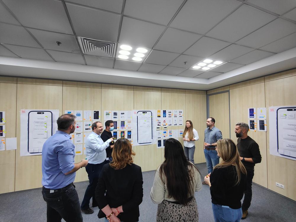
Around it, the team ran the research that fed into the redesign: usability testing with both new and returning users, and app-store review mining to find recurring complaints and feature requests. Findings were split by user type, by how many cards someone held and whether they were new to the product or experienced, so decisions could be based on how people actually behaved.
The workshop produced two things a tight timeline depends on: broad agreement on where the app was heading, and a clear list of next steps.
Branding: evolving from an established product
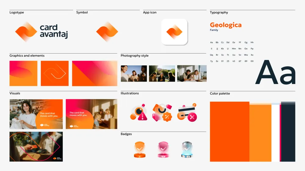
Sometimes you don't get to start from zero. Card Avantaj was already a success in Romania, one of the most widely used credit cards on the market, with strong merchant recognition and a loyal user base. But beneath those numbers lay a fundamental problem: it didn't really exist as its own brand. A product used by millions deserved an identity that felt distinct and recognisable, whether on a card, in a campaign or inside the app.
That's why brand design was essential to the project: to give Card Avantaj its own voice and emotional pull, while still respecting the existing Nexent system.
i. The Nexent branding foundation
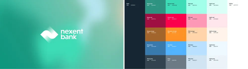
When Metyis first became involved, Credit Europe Bank was in the middle of a major transformation into Nexent Bank. An external Dutch agency had already created a comprehensive branding system: a visual language, a tone of voice and a set of design guidelines.
The system was solid, but it created an interesting constraint for what came next: how do you build a distinct product identity within an existing corporate brand system?
This is a common situation for brand designers. Working within an existing framework is harder than starting from a blank canvas, and it calls for a different kind of thinking. You can't ignore what's already there; you have to work with it while still building something new.
ii. Card Avantaj heritage: the merchant value and visibility gap
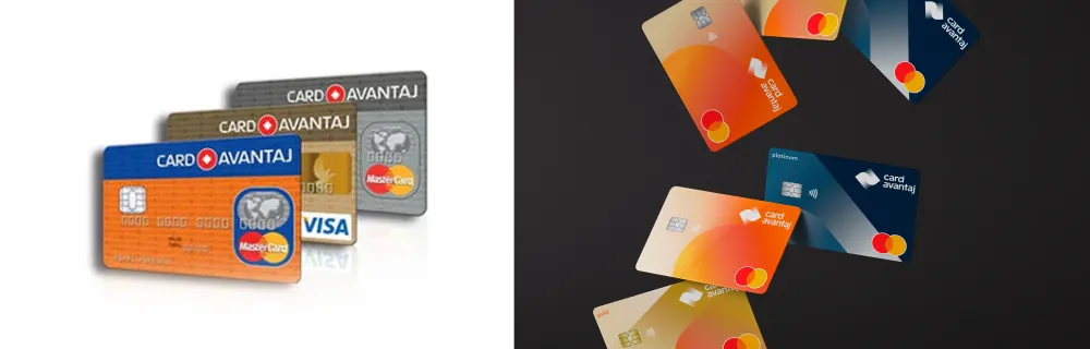
Card Avantaj had one real asset: merchant recognition. It was already widely accepted across Romania, and people knew it worked. But they knew it only as "their credit card from the bank." Even the old logo reflected that; it was essentially Credit Europe Bank's logo with the text swapped over.

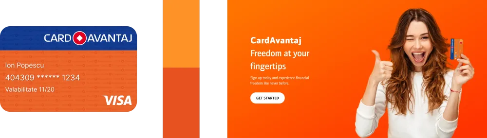
That was the key insight: the product had functional value but little brand value. People didn't think about it emotionally. They used it because it was convenient, not because they felt any connection to it.
So the decision was made: Card Avantaj would become a standalone brand within the Nexent ecosystem, independent enough to feel distinctive but connected enough to inherit the parent brand's trust and credibility.

The challenges
i. The colour dilemma
The project made one thing clear: colour carried far more weight than anyone expected. What first looked like a minor decision became one of the most decisive factors in the result, and we reached it through trial and error, testing how far we could push while staying true to the system.
The Nexent brand system already had an established palette: a dominant blue-green as the primary colour, plus a range of warm and cold accent and secondary colours. One inheritance stood out, though: orange, carried over from the old Card Avantaj brand and already part of Nexent's extended palette.
This led to a key strategic question: we couldn't abandon orange, so how could we make it feel innovative within the new system?
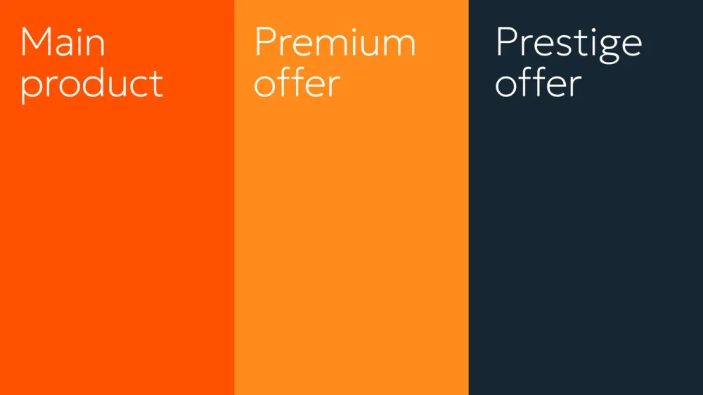

Our solution was to take the core Card Avantaj Orange and build a colour hierarchy around it, creating a clearer distinction across the card portfolio:
- Vibrant Avantaj Orange for the Standard tier.
- Mid Orange for the Premium tier.
- Dark Blue for the Prestige tier.
This colour-coded tier system felt distinctly Card Avantaj while still speaking the parent brand's visual language. The expanded palette mapped directly to product positioning, turning colour into a functional tool that signalled value at a glance and made customers' choices easier.
ii. Photography style: negotiating between markets
Our photography vision for Card Avantaj differed from Nexent's established approach. We wanted imagery that felt contemporary rather than institutional: natural, everyday moments. The client had a different reference point, the Romanian market standard, which leaned toward staged compositions, forced smiles and people holding shopping bags against colourful backdrops.

So it became a negotiation. The client wanted change but also familiarity; we wanted to be bold. Rather than pick one over the other, we looked for the middle ground. We kept the directness and clarity of the established style but added more vibrant colour and a stronger sense of genuine happiness, moving the imagery toward something natural and down-to-earth without dropping what the market already recognised.
iii. The iterations challenge
Along the way we explored many directions: multiple logo variations, different colour systems, various typographic approaches. The client wanted to see every possibility.
That carried a risk: not every option sent the right message. Showing ten directions can create decision fatigue and pull a project away from its core. Part of our job became explaining why some solutions were stronger than others, on strategic grounds rather than personal preference: why one colour hierarchy communicated more clearly than another, or how a particular typographic choice reinforced the brand personality we'd defined.
That constant back-and-forth between design exploration and strategic validation is what kept the project from turning into a pile of options instead of a coherent vision.
Building the app
The product had its own overhaul to go through, led by Zitec, who owned both design and development. Metyis' UX/UI stream contributed the research, direction and design principles and had a voice in many of the decisions, occasionally working hands-on. The starting point was a close look at the legacy app, AVANTAJ2go.
What the research showed
The old app worked, but it did little to support, guide or reward its users, and that gap set the direction for the redesign. Three problems stood out. People opened the app to stay in control of their account, yet the home screen led with hundreds of partner promotions, so they had to hunt for basic information. Important data sat inside collapsed sections and multi-step flows; checking something as simple as a credit limit meant digging through several layers. And the interface gave almost no feedback, so even a completed action felt flat and gave users little reason to return.
The team leaned on research throughout: competitor benchmarking, usability testing with new and returning users, app-store review mining, printed walkthroughs that users annotated, card sorting to check grouping and hierarchy, a five-second test for first-glance focus, and think-aloud interviews. The point of the feedback was to find friction and act on it, not to confirm what the team already believed.
The design principles
Two principles guided the redesign.
Make progress feel earned.
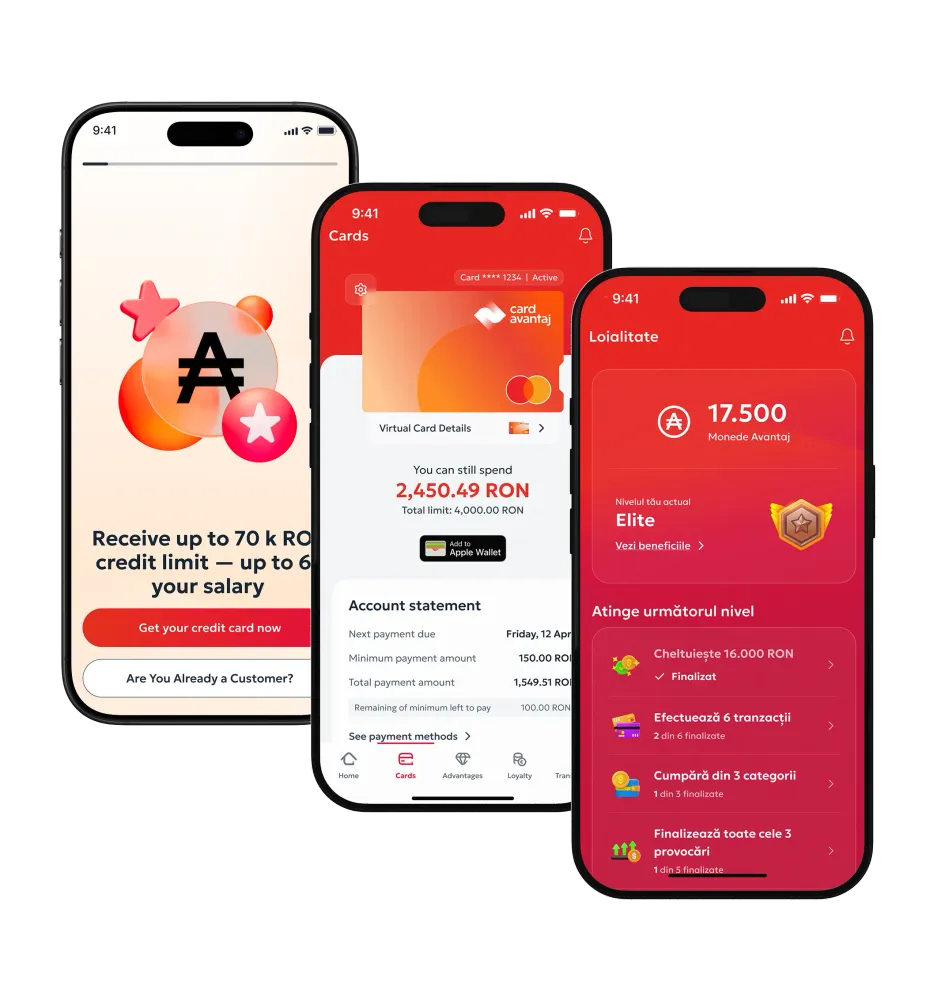
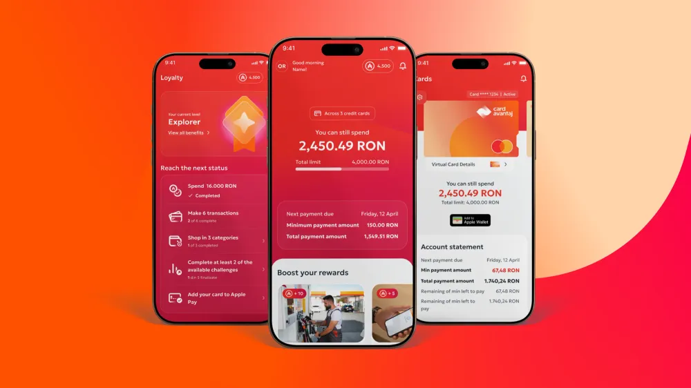
Routine card use was turned into a reward loop: purchases earn Coins, Coins unlock challenges, and challenges lead to badges and higher tiers. Meters, animations and unlocking tiers give that progress a visible form, so using the card and getting somewhere feels like the same thing.
Replace anxiety with structure.
Financial apps often bury the things people most need to see. Here the aim was the reverse. Instead of stripping out complexity, the team organised it: tools were grouped and labelled clearly, and navigation was rebuilt to match how people look for things, with limits near transactions and settings near the card. Layout and wording work together to point users to whatever needs their attention now.
From research to design decisions
The design decisions themselves were Zitec's to make and build; Metyis' role was to bring the research and rationale to the table. Some examples of how that research turned into design decisions:
- A Home screen shaped by testing. Research showed people open the app to understand their payments, not to browse promotions. The team tested two layouts: a card-per-box design that showed more but demanded more attention, and a single overview with the key actions immediately available. The overview was clearer and faster to read, and it became the new Home, leading with credit limit, due date and next payment, where the old app had led with partner campaigns.
- Key card data made visible. Minimum due, due date and IBAN had been tucked inside collapsible sections. They were moved out to sit permanently on the Home and Cards screens, so users no longer had to search for them.
- Important actions brought forward. Tasks like 3D Secure activation and viewing statements had been several menus deep. They were surfaced with clear labels and guidance, so they took less time to reach.
- Settings made easy to find. Card settings had been hidden in deep menus, so they were placed next to the card image, where people expect them.
- Loyalty rebuilt as motivation. The flat 0.3% cashback was replaced with tiered cashback from 0.3% to 3%, along with Avantaj Coins, missions, badges and tiers. Meters and step-by-step labels made progress easy to follow and gave people a reason to come back.
A shared design system
Holding all of this together is a reusable design system, owned by Zitec and shaped together with Metyis: shared components, interaction patterns and clear rules for spacing, hierarchy and behaviour. It keeps the product consistent from feature to feature and speeds up the handover between design and development, so new features now take days rather than weeks. After the MVP, the teams moved to two-week release cycles built on that shared system.
Accessibility was built in from the start rather than added later. The app is built to meet WCAG 2.2 AA, the accessibility standard required across the EU: text sizes and contrast meet the requirements, tap targets are generously sized and spaced, and grouping and whitespace help people who read or scan differently.
How it is right now
Results of the retrospective workshop
One year after the identity launched, we ran a retrospective workshop with the team to understand how the brand was landing, both internally and externally.
The conversations pointed to a shared aspiration: a brand that feels transparent, down-to-earth, easy-going and approachable. The final moodboard showed this through young people in motion, shopping, laughing, jumping, taking selfies, in a world of colour, energy, and spontaneity. The brand came across less as a financial product and more as a lifestyle companion.
One clear finding was the direction Card Avantaj should take: staying down-to-earth and transparent while embracing glamour in a more human, accessible way. In this sense glamour means the satisfaction of a fulfilled desire rather than exclusivity: walking out of a shop with bags in hand, or treating yourself to something you really want. That warmer, more relatable reading positions Card Avantaj as a brand that helps people enjoy the lifestyle they aspire to.
The day-to-day work
A year on, the work has settled into a routine across three areas.
UX/UI
Metyis continues to consult on UX/UI across the app and web: card management, payments, digital onboarding and the loyalty system. In practice this means setting direction, advising on new features and doing hands-on work when it's needed, while Zitec handles design and development for each two-week release, guided by analytics and user feedback. The main concern is consistency: every new screen should carry the same voice as the rest of the identity, so the app feels like Card Avantaj and not like any other banking app.
Branding
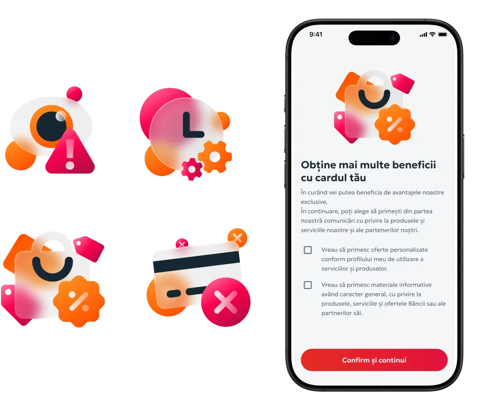
Evolving and developing Card Avantaj — continuing to extend and refine the identity as new needs emerge, from a library of 500+ badges to 10+ custom illustrations that give the product its personality.
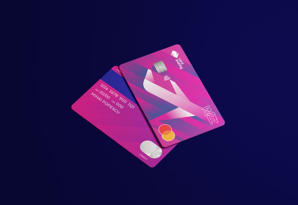
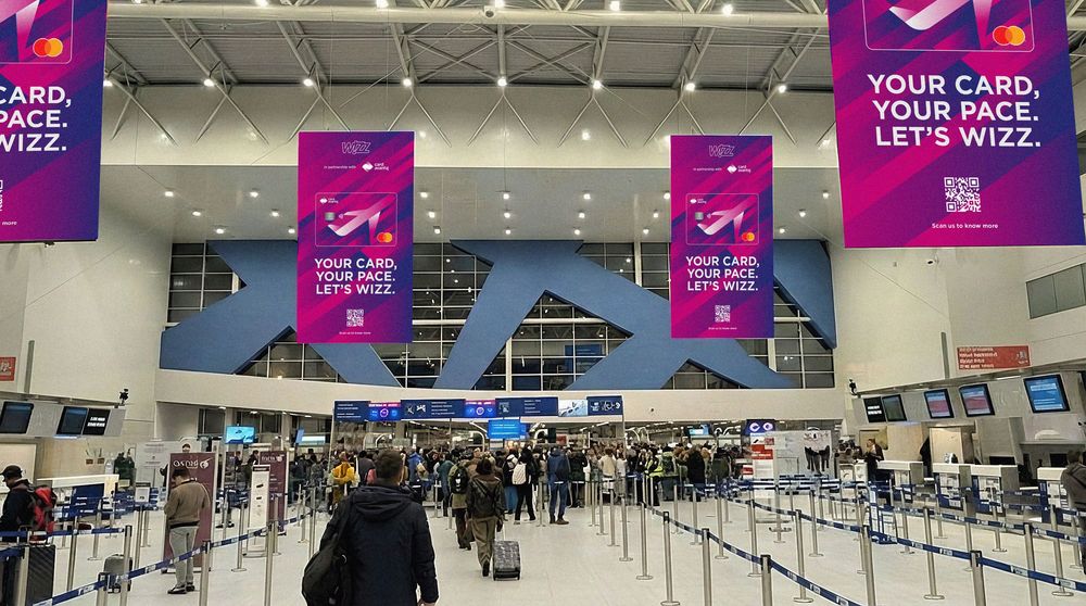
Co-branding — creating partner-facing versions of the brand. The clearest example is the Card Avantaj–WizzAir partnership: a Card Avantaj–backed card co-branded with WizzAir, supported by additions in the app and a dedicated communication and advertising campaign. It showed the system could stretch to fit a partner while staying recognisably Avantaj.
Communication
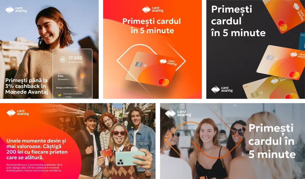
- Campaigns and always-on communication: Core Card Benefits campaigns, newsletters and homepage content. One of the campaigns we developed was for Members Get Members, built around the concept “Some moments just keep giving.” The idea was simple but resonant: using Card Avantaj isn't just a transaction, it's a way of sharing. We translated that into a visual world of shared weekends, good energy, and genuine connection, showing that Card Avantaj isn't just in your wallet, it's in the moments that matter.
- Our team was responsible for the strategic concept and key visual, defining the campaign's look, feel and message. The campaign was then adapted across digital banners, social media, outdoor and print. While Metyis led the creative direction, the local execution was managed separately, extending the campaign across channels while maintaining the core concept and visual identity.
The impact
How design helped
The first MVP was built and launched in three months, replacing several disconnected apps with a single, modern experience. Putting the information users came for up front, and rebuilding card management and loyalty around real behaviour, supported the bank's wider shift to digital. Design was one part of that shift rather than the whole of it, but it changed the experience customers actually touched.
Results and growth
The numbers improved across the board:
Public recognition
The app was named a Public Choice winner at the UX Awards. The winner was chosen by public vote, and we put it to our own users — so the recognition came from the people the redesign was built for.
KPI improvements
The figures above moved in the right direction over the same period as the redesign. Business metrics like turnover and spend have many drivers, so design is one contributor among several; the measures closest to the experience, app rating and engagement, are where its effect shows most directly.
Design as a driver of change
The constraints were real: an existing corporate brand system, a three-month timeline, two design streams and three organisations. Within them, Card Avantaj changed from a widely used but largely anonymous product into a recognisable brand with an app people are happy to use.
If you're working on something similar, where a product works but doesn't yet feel like a brand, this is the sort of thing our Marketing & Design practice does. You can see more of that work on our Marketing & Design Solutions page, which spans product and experience design, brand strategy and identity, content and communication design, and digital marketing, all part of the Metyis Design Studio. And if you'd like to talk through your own project, get in touch with our design Partner, André Covas.